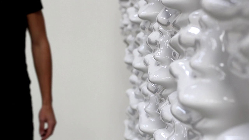
Canadian designer Thibault SLD Hexi is an interactive array of 60 hexagonal modules embedded with mechanical servos that use data from a nearby depth camera to physically respond to nearby motion just like a moving wallpaper.
Dean O’Callaghan created this wooden automated structure in an effort to mimic the effect of water drop as it hits a body of water.
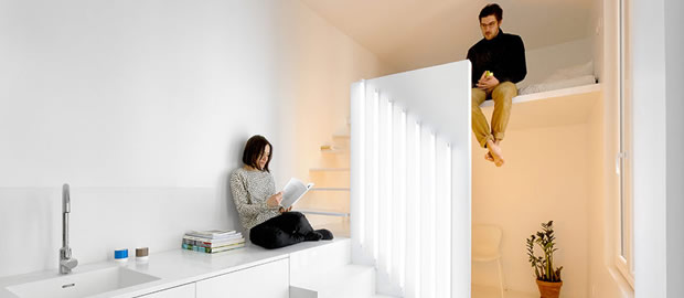
When asked by a client to refurbish tiny Parisian studio apartment, architects Raphaël Bétillon and Nicolas Dorval‐Bory came up with a design that required them to pay particular attention to interior lighting.
Hampered by a lack of natural daylight in the apartment, Bétillon/Dorval-Bory set about researching the colour rendering index (CRI) and created a unique approach to the division of space, using high-performance fluorescent lighting at one end and the apartment and low-pressure sodium lighting (LPS) at the other. The latter is commonly used for street lighting and is known for providing great efficiency, but poor colour rendering; however, its use was a deliberate ploy by the architects to help shape the space. LPS is certainly an unusual move – the monochromatic amber making everything indistinguishable – but provides a bold statement, with tasks such as sleeping and showering not requiring the same level of rich colouring as cooking. Named Spectral Apartment, the only lighting in the
studio flat can be found fixed to a small 2-metre high partition, which acts as the separator between kitchen and living space and bedroom and bathroom. The seven high-performance fluorescent tubes on one side of the partition give the modern kitchen the necessary light, while the reverse sees two zero CRI LPS lamps fitted. Each lighting source has a different switch to create changeable lighting patterns, for different uses of each area. The sleeping area, which is a small crawl space bunk, is accessed via slim cantilevered stair treads that require treading on the kitchen worktop half-landing; while underneath exists the bathroom and a surprisingly roomy shower. The minimalist and economical design of this studio apartment most certainly will not be to everyone’s liking, especially…
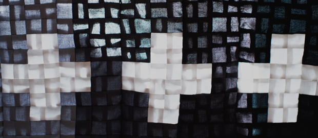
Celine Kim managed to sew this Baby Quilt Blanket after being inspired by Pia Wallen Cross Blanket and this ombre sweater from Erica Smith's Pinterest page.
The featured photo shows details from the back of the quilt as light passes through, if I was a baby then I would surely love to hide myself under this great looking Quilt Blanket. This is Celine Kim's Baby Quilt Blanket and this is Pia Wallen's Cross Blanket They look both pretty nice. Now if only I was a baby!
The Chinese language has an alphabet of 37 letters and 4 different tones(it was created as a phonetic alphabet that makes up the sound of the character alone) is considered to be one of the most difficult but interesting languages for someone to learn.
A female designer ShaoLan from Taiwan developed Chineasy, an illustrated type that showcases what the chinese symbol means promises to help you learn chinese easier and faster. Her method of learning Chinese uses a number of various static and animated pictograms along with different shapes, forms and colours
that help students attaching meaning to each Chinese letter making it easier to remember it and tag it for future use. If you want to try it out visit Chineasy and start learning chinese right away! [toggle title="source"]Delightful pictograms demystify the Chinese language | Typography | Creative Bloq


