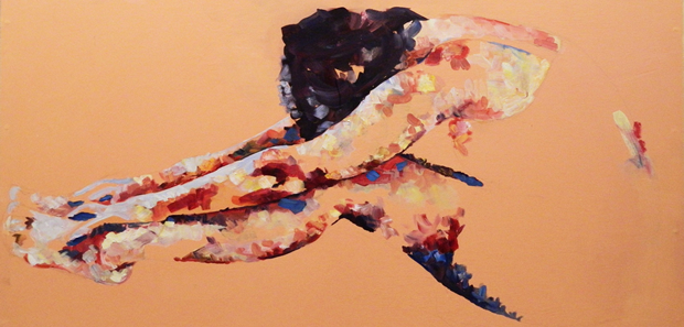
When asked by a client to refurbish tiny Parisian studio apartment, architects Raphaël Bétillon and Nicolas Dorval‐Bory came up with a design that required them to pay particular attention to interior lighting.

Hampered by a lack of natural daylight in the apartment, Bétillon/Dorval-Bory set about researching the colour rendering index (CRI) and created a unique approach to the division of space, using high-performance fluorescent lighting at one end and the apartment and low-pressure sodium lighting (LPS) at the other. The latter is commonly used for street lighting and is known for providing great efficiency, but poor colour rendering; however, its use was a deliberate ploy by the architects to help shape the space. LPS is certainly an unusual move – the monochromatic amber making everything indistinguishable – but provides a bold statement, with tasks such as sleeping and showering not requiring the same level of rich colouring as cooking. Named Spectral Apartment, the only lighting in the

studio flat can be found fixed to a small 2-metre high partition, which acts as the separator between kitchen and living space and bedroom and bathroom. The seven high-performance fluorescent tubes on one side of the partition give the modern kitchen the necessary light, while the reverse sees two zero CRI LPS lamps fitted. Each lighting source has a different switch to create changeable lighting patterns, for different uses of each area. The sleeping area, which is a small crawl space bunk, is accessed via slim cantilevered stair treads that require treading on the kitchen worktop half-landing; while underneath exists the bathroom and a surprisingly roomy shower. The minimalist and economical design of this studio apartment most certainly will not be to everyone’s liking, especially…

Designed for the Kernel Festival 2011 in Villa Tittoni Park, Desio, Italy by Gianluca Milesi, Michiko Yamada and Edi Zulga, Shadows offer a unique way to provide public park users and festival goers with shade, shelter from wind, and light (through the use of neon lamps) during relaxation.

Clearly inspired by the digital aspects of the festival, the Milesi Shadows are built using cast-iron rods, reinforced plastic profiles and sustaining polycarbonate panels, providing a wave-like self-standing structure that can be moved and manipulated by the public. The temporary nature of

this project played a big part in the concept of Milesi and Yamada, and pallets have been used to define spaces and creating seating and furniture areas. The architects describe the Shadows as a “harmonic, imaginative, and elegant conjugation.” I couldn’t agree more.

When designing her unique modular public seating system, Latvian architect Ligita Brege came up with the name MEET ME! – a name that sums up this piece of contemporary architecture perfectly.

MEET ME! is all about public interaction and engagement, and using the differently positioned wooden modular benches does exactly as the name suggests – encourages people to meet. Far too often, people sit no more than a few feet from each other on park benches, without even passing small talk, MEET ME! promotes communication and togetherness as people inhabit the public meeting area. Brege’s design is a visually compelling one that demands further exploration and, with the wooden seating areas open to manipulation and configuration to create a social area of different levels, the architect’s goal of getting users to…

Situated in the Cantagua Housing Complex, V Region- Chile, Cantagua House is the work of Chilean architect Daniel Uribe and sees the use of raw materials and eye for detail working together to create a three-volume property that effortlessly blend into its surroundings.

Intended as a holiday home on the Chilean coast, Cantagua House is a remarkable project on an extraordinary site. Three geometric volumes react to the topography of the area and accentuate the strong bond between structure and nature. The main volume of the property is the foundation and serves as the connection between the other two volumes. This base also has a direct relation to the ground floor, where the main entrance to the home can be found. In creating the living areas, Uribe has designed a suspended volume, which encompasses the main elements of the home: living room, dining room, and Master bedroom. The third (back volume) harbours the kitchen and remaining services areas and is located

in a more private area at the back of the home. The northern façade of the building is what gives the design its holiday home feel, promoting openness and transparency, while overlooking the vast openness of the sea. In comparison, the south façade is rather more downbeat (but necessary), connecting to the main Cantagua Housing Complex and allowing more privacy to residents. Separated from the main house by two courtyards, designed to allow natural light and ventilation, Cantagua House also boasts guest rooms, a spa, and further service areas. In creating Cantagua House, Daniel Uribe has shown how surroundings can be used to influence design and develop a structure that is truly comfortable with everything that surrounds it.

Designed back in 2009 by Prentiss Architects, Ballard Cut is a modern contemporary family residence in Seattle, Washington.

After having resided on a boat for 14 years, the client’s desire to make the transition to dry land was integral in the designing of the property and can be seen immediately in the raised first floor of the property which, when accessed by boardwalk, gives the appearance that the house is “floating” above the surrounding yard. The location of Ballard Cut in the Ballard neighbourhood of Seattle is a prime one and gives stunning views of the Sound and the Olympic Mountains; thankfully, Prentiss Architects have paid special attention to achieving views of the surroundings. Hampered by the site (which has a steep slope to the west and railroad easement to the east), the architects were given little choice in where the main floor

of the property could be located, instead using a canted second floor, rotated on an axis to achieve views of the aforementioned surroundings from the bathroom, bedroom and office. The second-floor position also allows for access to the roof garden. The west elevation of the property is mostly glazed, giving the home a modern, bright, and open feel and allowing access to the views. The east side, on the other hand, is hindered by noise from the railroad, giving the architects little choice other than to create a wall with few openings, acting as both a sound barrier interior insulation. A minimalistic theme is very apparent throughout the property, with inexpensive materials used for economy. The use of low-cost concrete fibre board works well on…

Celine Kim managed to sew this Baby Quilt Blanket after being inspired by Pia Wallen Cross Blanket and this ombre sweater from Erica Smith's Pinterest page.

The featured photo shows details from the back of the quilt as light passes through, if I was a baby then I would surely love to hide myself under this great looking Quilt Blanket. This is Celine Kim's Baby Quilt Blanket and this is Pia Wallen's Cross Blanket They look both pretty nice. Now if only I was a baby!